
Rose Art Museum Opening
According to the Rose Art Museum website, the Collection in Focus series “highlights and draws new connections between important and often understudied objects in the museum’s collection.”
The pieces currently on view in Collection in Focus certainly seem to be understudied—I had never heard of any of them nor their creators. The famous Lichtensteins and Warhols were not on view. The introduction to the exhibit on the wall says that this particular Collection in Focus is focused on highlighting women artists who work in a variety of artistic mediums. The works seemed to adhere to the focus of the exhibit but from first or even second glance they did not seem to go together. If a patron had not read the description on the wall, the works might seem completely randomly chosen.
Walking into the Mildred S. Lee Gallery, Elizabeth Murray’s “Duckfoot” (1983) greets the viewer and is the epitome of a medium-defying work. The piece is gigantic—spanning a large portion of a wall. It is made up of warm-colored circular pieces of canvas that overlap one another. The most interesting thing about the piece is, as the description notes, it is both three-dimensional and flat. The overlapping cutouts of canvas create a 3-D experience but the fact that the canvas is painted also signifies an aesthetic of one-dimensionality.
To the right of “Duckfoot,” five other paintings from various female artists are arranged in a cluster. Looking at the paintings, there seems to be nothing congruous about them. But maybe that is the point—the exhibit’s motive is to display a variety of media after all. Some were created with a lithograph, some with textiles and some with paint.
Collection in Focus certainly presents a variety of lesser-known pieces in the Rose’s permanent collection, but I would have liked a more cohesive theme for the pieces.
-Emily Wishingrad
Artist Alex Hubbard does something most artists do not even attempt to do; he works across two different mediums in his art—video making and painting. And the current exhibition at the Rose does justice to these two distinct styles, displaying one of his paintings as well as one of his video installations.
“Duckbutter,” (2014) which sits outside the Rose Video Gallery, actually looks kind of buttery. But that might just be my biased opinion after I saw the title. Blotches of various shades of reds and purples cover the canvas. In the background, a stroke of neon orange winds through the other colors. The variety of textures constitute a lot of what makes the work interesting. The dark purples pop out of the painting and almost looks like the texture of pottery glaze while the reds take to the background—creating the flatter parts of the painting.
The short film, “Annotated Plans for an Evacuation” (2009), takes the viewer through a series of hilariously bad attempts to transform a car into some kind of getaway vehicle. In the film, Hubbard slathers white paint onto the tires, fixes a white cardboard backdrop behind the car and spray-paints the windows green. The transformation process takes the car from a realistic looking vehicle into a cartoony-version of its former self. The car starts to rumble to a start with Hubbard driving. While moving, the car starts to deteriorate—pieces fall off. Stopping in the middle of what the viewer presumes to be a street, although no street is shown, Hubbard gets out of the car and, aided by an unnamed man, starts to further transform the car yet again, adding more accoutrement onto the car. The whole thing is very haphazard, although throughout the process, Hubbard seems very sincere and deliberate.
“Duckbutter” and “Annotated Plans for an Evacuation (2009)” both presented very different aesthetic experiences for the viewer through very different mediums. But thanks to Hubbard’s refusal to provide a suggestion of their meanings, they both caused me to think.
-Emily Wishingrad
The Rose Art Museum’s exhibit, 1914: Magnus Plessen, presents itself as a representation of brutality. Upon entering the exhibit, a sign warns that the paintings and photographs of the wounded soldiers are not for the faint of heart. Featuring thought-provoking images of marred faces, detailed wax masks and breathtaking paintings, 1914: Magnus Plessen is an exhibit attendees are unlikely to forget.
The exhibit, which presents as an academic forum for linking Plessen’s work with relics of his inspiration, includes collages of the scientific photos, with the injured parts of the soldiers’ faces covered by white paper. Toward the center of the exhibit is a delicate wax mask—a replica of the ones artists made for the injured veterans to wear as an alternative, or in addition to, reconstructive surgery. These materials alongside the original photographs of the soldiers, their masks and the book that inspired the artist, provide context for the work and illustrate the artist’s thought process.
The artist, Magnus Plessen, was inspired to make anti-heroic art after encountering War Against War by Ernest Friedrich, which was also on view. Friedrich’s unequivocally anti-war book showcases eerily disfigured, scientific photographs of WWI veterans with severe facial and head wounds. Plessen draws on the novel in his art, employing contrast to underscore the soldiers’ missing features. In Plessen’s paintings, soldiers’ faces and body parts are scattered across the canvas. Soldiers’ missing eyes, noses or other facial elements are replaced by deep black shadows, as if that part of the canvas has been reduced to empty space, waiting to be filled.
The exhibit’s brochure says that “World War I in particular has been seen…as a necessary but undesired response to foreign aggression, and subsequently by historians as a tragic, inexorable chain of events.” This tension between the initial reasoning and the actual results of war is evident in Plessen’s work. Plessen incorporates a variety of different materials, color schemes and moods into his artwork in order to express this theme of opposition. In the brochure, Plessen comments “I could also never forget about the portraits of soldiers looking at you with their faces blown apart.” Plessen’s imaginative rendering of the veterans adds to the theme of brutality and helps ensure that the after-effects of war will never be forgotten.
-Brooke Granovsky
Sea Monsters is an exhibit made up of four large multi-media canvases and six repurposed buoys, which are used as canvases for a multimedia painting.
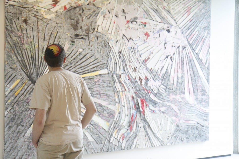
Among the paintings that make up Sea Monsters, one of the most interesting is called “Tongue in the Middle of the Port.” Bradford uses a narrow yet effective pallete of reds, whites, blues and blacks to evoke a certain emotional reaction in the observer. The multidimensionality of the work is produced by straight indented li nes branching out like a star. Randomly placed black circles of varying sizes scatter the painting. Upon closer examination, the viewer finds that some small parts of the canvas have actually been covered with silver duct tape in place of paint.
Also interesting is the ensemble of six repurposed buoys scattered throughout the top floor of the Rose. The six buoys actually make up one work that Bradford has entitled “Sea Pigs.” One buoy particularly stands out: the one in front of “Tongue in the Middle of the Port” is the only one that is so dilapidated as to be completely deformed, no longer holding the shape of a buoy at all. The placement of this one in front of that specific painting is an interesting question for all visitors to ponder. This particular buoy seems deflated, almost useless when compared to the others, though even the other buoys are not in terrific shape compared to buoys being continuously used.
Though there are many unique and interesting features about each artwork in the exhibit, they do seem to be united by a few things. Chief among them is an extreme attention to detail, something that is obvious in Bradford’s work. In Art in America magazine, Bradford himself stated “For me, it’s always a detail—a detail that points to a larger thing.” It is up to each viewer to individually decide what that larger thing is.
-River Heisler

Please note All comments are eligible for publication in The Justice.